This assignment proved tricky because I had already done a pastel drawing of apples which I thought might be okay for the assignment. However, I decided to try something new.
This morning I set up a still life, and took a few photos, did a few thumbnails and tried to work out how to do it. I wanted apples and silver so that there would be lots of reflections of apples in different forms. I put some flowers on a glass ( as recommended in the book ) grapes, coffee cup and saucer, and tried it out.

 .
.It was all looking very contrived.
Far too fussy. Away went the grapes and coffee cup. Away went the flowers
 This was looking better.
Pastel on A2 pastel paper.
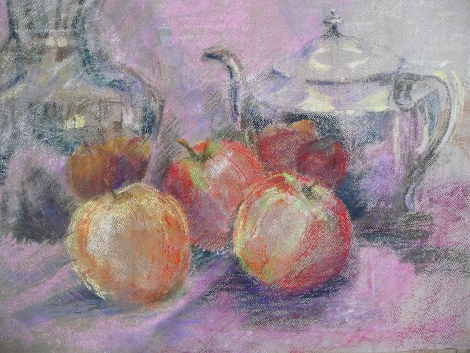
This is the first sketch of how I want it to go. The idea is to show the apples in reflections as they are slightly distorted. The colours are subtly different and I wanted the reds and pinks to play around with. I am trying to use complimentary colours for the shadows and to show the sharp edges of the apples. I am trying to work the form of the teapot by the reflections and by the strong form of light. The far right of the teapot disappeared into the background whereas the spout was very strong against the towel, which I have tried to indicate it's fluffiness by softening the edge just left of the first apple.
One of the problems was that my tutor wants me to do bigger work and working bigger into the forms.
This is A2 and the problem is that the objects are twice the real size which means I am constantly trying to enlarge what I see. If I draw them life size, the paper is too big for them, if I add more things, (like the flowers ) it is too overcrowded.
The silver just on the left is not right yet. Much more work to be done. The apples will be fined tuned to look like apples and the first left one will be further forward. Meanwhile, most of the time was in getting the overall composition to work.
I decided on the three apples which makes a triangle in order to lead the eye into the picture. Once in, the eye goes to the reflections which indicate the nature of reality versus distortion of what ever the true may be.


Experiments with mark making.
Ink on watercolour paper. pastel, charcoal and bamboo pen. All over the paper while it was still wet then whit pastel when it was dry.
This was a reaction to my representational style and need to loosen up. It was very quick and I could see it getting more abstract and would like to do more.
The experiments with different media is something I have been procrastinating about for some time now.
First I tried marker pens.
Starting with the apple of my pastel drawing, I was not sure how to mix them and as the colours were very brash picked out red and yellow and put pen to paper.
Predictably bright and unwieldy. It felt like a child's version of drawing. lots of lines, colouring in and no subtly at all. I could not see the point.
 |
| Marker Pens |
 |
| Inktense Pencils |
Next came Inktense pencils. Similar to coloured pencils. The drawing was okay but when I added water, the colours lit up, ran all over the place and I thought I might as well be painting in watercolour. Why draw when it is going to end up looking like painting?
It was easier to mix the colours but it took a lot of scribbling to cover the surface when I could have used a brush and watercolours to get the same effect for less effort. The boundary between drawing and painting seemed to vanish. I drew on top just to show that it was a pencil not watercolour.
This is a quick sketch on the IPad using the app, brushes, and I found it similar to using the marker pens but much better to mix colours and, ultimately, make better marks. It will take practise but i feel there is more flexibility to be creative than with the marker pens.
 |
| IPad |
This is a quick sketch on the IPad using the app, brushes, and I found it similar to using the marker pens but much better to mix colours and, ultimately, make better marks. It will take practise but i feel there is more flexibility to be creative than with the marker pens.
My feeling now is that it is not fair to judge these different media after only bone try and I need many hours of experiments and practise to give it all a fair chance.
I will keep and open mind and keep practising!
This picture is one done earlier which is more representational but possibly more what is required for the assignment.
I am beginning to get quite confused as to what is actually wanted. Experimentation or observation. How to combine both?
 |
| Assignment 2? |
 |
| Assignment 2?? |
This is looking better. More tonal contrast but the top left does not work. Back to the drawing board.
This is the final drawing so far. I have softened the left jug. Cropped it slightly to put the edge of the jug approximately at the golden mean. The idea of the composition is to lead the eye in through the centre of the apples, then see the reflections each side to the teapot spout and lid, across to the more vague silver jug on the left, and back again. Blue-pink contrasted with yellow-orange with deep red in the reflections. Shadows of complimentary colours.

This is like a farewell performance. This really is the final drawing! After the google hangout last Saturday and criticism from Ilsa Brittain and others who said it needed more attention to the composition, here it is. It is more like the intention in the cropped photograph. I wanted to show the contrast between the light against dark changing all the time according to what was happening from each edge. Sometimes the edge disappeared and sometimes it changed from being dark to light according to what it was next to.
The difference in the size of the apples, from very large ( in the foreground) to very small ( in the reflection) was important to the whole intention of showing real versus reflected.
No comments:
Post a Comment