I have just put together my work for assignment 2 and some exercises and feel I would like to do most of it again.
I am surprised ( perhaps not!) at how careless I have been in not reading the instructions properly. My biggest mistake was in the tonal drawing. I read the project, looked at the image in the book and of I went to draw a still life in pastel. I completely omitted to put in any natural form! The whole of part two is about natural form.
I used an A3 sketchbook, used both sides of the paper and found that, when it comes to presenting work for the assignment, there was a problem!
I am very aware now of how much I see in paint. This is becoming very clear and the minute I start to use colour in drawing, I see everything in terms of a painting. The difficulty of mixing colour with different media was very frustrating to me.
For me, it got very confusing to think in terms of drawing but to use colour which could not be mixed easily. I cannot see the point of trying to use colour in drawing without having a better intention as to what I am trying to achieve. For this reason I would like to do most of the work again and really think about what and why I am doing it. When I did use colour it was too bright, no drama and no atmosphere.
I would like to do far more drawing in black and white, using different marks. The range between charcoal, pen and ink, pencil and graphite is enormous and I feel I have not explored it enough. I would like to spend more time on line drawing as well. Using all the different colours and media took away from the importance of line in my opinion. Line drawing is one of my weak areas and needs more practise.
I found the brightness of fruit quite disturbing in most of my drawings and would like to rectify that by tackling it all differently.
Apart from fruit and veg, the natural objects found on a walk did not appeal to me in any way as I found it difficult to make a composition out of them. They should have been left on the walk, drawn in situ and worked out so that they were part of the landscape instead of being taken from it.
I would love to spend more time on drawing animals and felt that the section on it did not give enough attention to it.
It seemed out of balance to spend so much time doing still life with so many different media but not spend time exploring the anatomy and texture of animals. How to draw animals in situ, combining background, composition of one or many; there seemed a huge chunk that was not dealt with.
The flowers in coloured pencils was a nightmare and it is only now that I realise that I need to spend time using line to draw flowers and learn how to do that before attempting them with coloured pencils. It come back to drawing rather than painting again. If I see flowers in terms of paint, it is going to be difficult to see them in terms of line.
Assessment criteria points
Demonstration of technical and visual skills.
I think I have demonstrated a certain amount of skill both technically and visually except the skill of coloured pencils. Oil pastels I need to work on more.
Quality of outcome
The quality of outcome is not up to my standard so far. Presentation needs a lot more work and in a more coherent manner. I think my communication of thoughts and ideas are just okay but still need improvement.
Demonstration of creativity
I have not shown enough creativity so far and wish to improve on that.
Context reflection
I have done more research than is shown but I need to get more written up. Critical thought is there but not written sufficiently.
Tuesday, 10 July 2012

Friday, 6 July 2012
Fish on a plate
Watercolour pencils ( blue and purple ) on watercolour paper with wash and sepia ink splattered. Approximately A3 size.
This is done very quickly because I realised that I did not want to take the fish out of the paper, let alone stare too long at these dead creatures. They are on a plate which is covered by the paper.

I started with blue water coloured pencil, followed by purple. Washed roughly. drawn into with blue and purple. Splattered with sepia ink and drawn into with a goose quill picked up in a field.
I have not got enough detail in the fish and I have not shown the light shining on the scales. The paper is roughly drawn and not accurate. Instead, I went for the composition, the freshness and the despair of the fish.
Saturday, 30 June 2012
I Cannot Play the Violin! (i.e..coloured pencils )
I cannot play the violin and what is more, I don't want to.
Here is the dilemma. Would I want to if I could or can I not play because I don't want to?
I have to admit that I dislike high notes of any kind and that my worst nightmares have been when sitting to the right of piccolo players or the triangle player. It hurts! There have their place but not anywhere near me.
I first picked up a violin when I was 8yrs. old and quickly discovered that if I held in on my lap, pegs up, body down, I could bow more easily and it did not hurt as much. Later on in life I discovered it was called a cello and it was bigger. Good. Progress.
Playing the cello was fun but sitting in an orchestra with all the other cellists I found claustrophobic. I looked behind me and saw a double bass.
That moment started a a life long love affair with the double bass and the world of low notes.
Low notes are basis of all harmony, bass players are down to earth, real and most of them do not dash up and down the fingerboard showing off their concertos.
My double bass and I have been happily joined at the hip for nearly fifty years looking down from my high stool at the others scampering around trying to achieve some kind of peace of mind with their instruments.
What this is about is my dilemma with coloured pencils. I can only compare the art world with the music world in that it takes many years to find one's way, practise and get on with it.
Coloured pencils are like the violin. Completely alien to my way of thinking. I have tried them and they do not do what I want them to do. Should I change my perception of them? I have tried them, on white paper, on grey paper, over acrylic, over watercolour and still cannot see the point of them ( no pun intended.)
What would I do with them if I had completely mastered them? Would I be able to show life, movement, the excitement of colour? The experiments of going wrong and then correcting it without using a rubber?
One line with a coloured pencil does not express much unless followed quickly by another, and another and another. Even then, they do not express what I want to express.
Do I want to spend time struggling to get a technique which I don't want to use because it is contradictory to what I love?
I could not play the violin because I did not like the high notes. I still don't like high notes.
Here is the dilemma. Would I want to if I could or can I not play because I don't want to?
I have to admit that I dislike high notes of any kind and that my worst nightmares have been when sitting to the right of piccolo players or the triangle player. It hurts! There have their place but not anywhere near me.
I first picked up a violin when I was 8yrs. old and quickly discovered that if I held in on my lap, pegs up, body down, I could bow more easily and it did not hurt as much. Later on in life I discovered it was called a cello and it was bigger. Good. Progress.
Playing the cello was fun but sitting in an orchestra with all the other cellists I found claustrophobic. I looked behind me and saw a double bass.
That moment started a a life long love affair with the double bass and the world of low notes.
Low notes are basis of all harmony, bass players are down to earth, real and most of them do not dash up and down the fingerboard showing off their concertos.
My double bass and I have been happily joined at the hip for nearly fifty years looking down from my high stool at the others scampering around trying to achieve some kind of peace of mind with their instruments.
What this is about is my dilemma with coloured pencils. I can only compare the art world with the music world in that it takes many years to find one's way, practise and get on with it.
Coloured pencils are like the violin. Completely alien to my way of thinking. I have tried them and they do not do what I want them to do. Should I change my perception of them? I have tried them, on white paper, on grey paper, over acrylic, over watercolour and still cannot see the point of them ( no pun intended.)
What would I do with them if I had completely mastered them? Would I be able to show life, movement, the excitement of colour? The experiments of going wrong and then correcting it without using a rubber?
One line with a coloured pencil does not express much unless followed quickly by another, and another and another. Even then, they do not express what I want to express.
Do I want to spend time struggling to get a technique which I don't want to use because it is contradictory to what I love?
I could not play the violin because I did not like the high notes. I still don't like high notes.
Thursday, 28 June 2012
Honesty in art
Yesterday I had a meeting with an artist called Greer Ralston with a friend of mine who is thinking of starting up a giclee printing business. Two hours later and a couple of phone calls from Greer, I am learning more and more about the art world. What struck me most about Greer is her honesty. My would be printer friend is one of the most honest, thoughtful and decent people I know and it is going to be interesting to see how he copes with a bunch of artists.
The art world seems to be full of egos, artist competing with each other, dodgy deals with printers, framers and agents, galleries pulling a fast one to avoid bankruptcy. Getting known seem to be the aim of most artists and "Emperor's New Clothes" springs to mind. Huge intellectual snobbery and full of pseudo babble.
Dishonesty is not only in the material world but in the way in we we can tackle drawing.
She talked a lot about the honesty of artists and pointed me in the direction of Frank To, Norrie Harman, and Joyce Gunn Cairns. I found it really interesting seeing the difference in approach of these artists. Frank To has become very famous and, to me, shows the more dishonest way of drawing. Very clever, very accomplished but leaves me cold. Joyce Gunn Cairns is worthy of several visits. Her work and her writing has such depth and it epitomises honesty and the search for meaning.
Norrie Harman has the same quality but with more drama. His drawing of " Hilary goes shopping" is painfully poignant.
This all stresses to me the importance of keeping true to yourself, questioning and at the same time practising over and over again the skill of drawing. Without the skill it is too easy to let the ego take over and get known at all cost but without the integrity.
An honest drawing to me has to have the intention of, firstly, understanding the subject, looking and seeing more and more, and then, trying to draw what is seen. With experience and practise, more and more is seen on every level.
Too much feeling and it is too nebulous and self conscious. Too much technique and it is cold and unfeeling.
Too much feeling and it is too nebulous and self conscious. Too much technique and it is cold and unfeeling.
Both Norrie Harman and Joyce Gunn Cairns show the frailty of human nature but with power and love for the subjects.
I am left with feeling that it is okay to be human, it is painful at times but there is great strength in that vulnerability.
Tuesday, 26 June 2012
Flowers with Coloured pencils
 |
| 1 |
The start of flowers in coloured pencils! So far not happy...
Watercolour pencils and an attempt to cover an A2 sheet of grey pastel paper with something that I can work on.
How on earth do I face a sheet of paper that large with a pencil point?
The sound of the pencils across A2 paper really set my teeth on edge and so I quickly changed to water coloured pencils, draw very quickly and then brushed it with water so that the colour ran down the board.
Grey pastel paper seemed the best way of dealing with the white of the flower heads and to get the paleness of the flowers. Also tough enough to take a lot of messing around with water plus pencils.
What a mess!

 |
| 3 |
The third attempt was greatly helped by a fellow student, Louise, who suggested underpainting. Her example gave me hope and I started throwing acrylic paint at the paper. As it dried so quickly, I worked fast and just tried to cover as much as possible. It was a huge relief to be able to mix colours again.
To be able to get the colour as I want instead of being at the mercy of a medium that imposed it's own colour meant I could work with it rather than against it.
 |
| The Lost Pencils |
The next task was to use the coloured pencils to achieve some degree of detail.
However, to my surprise, I lost my set of coloured pencils.
I had the watercolour ones but the coloured pencils had completely vanished. I have now spent two days searching for them. No sign of them.
I then started to scratch some detail of the flowers into the dry paint. It took all my time to just get the pencil to show up. Pencil sharpener was wearing out and still no detail was manifesting.
Now, a day later, the flowers have wilted, flower heads closed and the light has gone.
I then started to scratch some detail of the flowers into the dry paint. It took all my time to just get the pencil to show up. Pencil sharpener was wearing out and still no detail was manifesting.
Now, a day later, the flowers have wilted, flower heads closed and the light has gone.
It has been raining for three days and I am NOT going outside to capture the real thing.
I found I was so busy trying to get the watercolour pencils to make a mark that I got lost with the actual drawing. The ellipses are wrong, the perspective is wrong and the tone is non existent.
It is dead, lifeless and not worth the effort involved in trying to achieve detail.
What I saw in the flowers was the drama of colour, the movement and the life. This has not been expressed in any. Because of the conflict of trying to do something I did not see, the drawing suffered.
I would rather do a monochrome pencil drawing of flowers in order to describe detail. To get detail when I can't mix the colour seems a waste of time.
Perhaps it is time to do something else?
Flowers revisited
I decided to rethink what was wrong with my drawing and came up with the idea that for me, drawing flowers is to show the essence of flowers which is that they are organic. This means that the drawing should be organic and have a life of it's own.
The conflict was in using coloured pencils which need planning and organisation. This is not how I see anything that grows. Flowers have a quality of life which I found difficult to capture. This time I tried using a 2b pencil and started in the middle of the paper and let it grow by itself without planning anything. I draw what I saw, which is blurred by my shortsightedness and also because I did not understand what I was seeing. I just draw what I saw.

An ordinary pencil has a quality of line and softness which is able to convey movement and tone which the coloured pencil, to me, does not have.
Early days.... Yet to complete this.
It occurred to me that my mistake was in trying to get a reasonable composition without being able to draw flowers in the first place.
Also, I tend to see in colour, shape, paint and tone. Perhaps the best way to draw flowers is to use line.
It is dead, lifeless and not worth the effort involved in trying to achieve detail.
What I saw in the flowers was the drama of colour, the movement and the life. This has not been expressed in any. Because of the conflict of trying to do something I did not see, the drawing suffered.
I would rather do a monochrome pencil drawing of flowers in order to describe detail. To get detail when I can't mix the colour seems a waste of time.
Perhaps it is time to do something else?
Flowers revisited
I decided to rethink what was wrong with my drawing and came up with the idea that for me, drawing flowers is to show the essence of flowers which is that they are organic. This means that the drawing should be organic and have a life of it's own.
The conflict was in using coloured pencils which need planning and organisation. This is not how I see anything that grows. Flowers have a quality of life which I found difficult to capture. This time I tried using a 2b pencil and started in the middle of the paper and let it grow by itself without planning anything. I draw what I saw, which is blurred by my shortsightedness and also because I did not understand what I was seeing. I just draw what I saw.

An ordinary pencil has a quality of line and softness which is able to convey movement and tone which the coloured pencil, to me, does not have.
Early days.... Yet to complete this.
It occurred to me that my mistake was in trying to get a reasonable composition without being able to draw flowers in the first place.
Also, I tend to see in colour, shape, paint and tone. Perhaps the best way to draw flowers is to use line.
Friday, 22 June 2012
Buddhism and life as an artist.
I thought I would write about how Buddhist is affecting me in this work with the OCA. Or is it the other way round?
I am getting more aware of my own nature both of my work and others and so I need to get back to what Buddhism means to me and how I practise.
Meditation, watching the mind and seeing my own thoughts is familiar to me. One main practise is to offer up all of myself, my possessions, my ego and mind to the concept of Buddhahood. To be able to let go of what I consider " mine" has been part of my practise for a few years now.
This has been in the background since doing the OCA course and it is time to look at it again.
The course notes and instructions are fine in that it is about self reflection and observation. No problem with that. However, not only am I noticing the competitive side of myself but the ambition and drive to succeed is there also. Trying to do well. Looking for approval. All the stuff I have been trying to push to the background. Perhaps the way forward is to offer it up and let go!
Time to rethink why I am doing the course? I want to learn, to see and to go forward in what I do. Do I want to prove to myself that I am able or do I want to be noticed? When no one comments on my work I feel ignored but when it is praised I question the integrity of the other person. This is old stuff of mine.
When some one I admire praises me I feel really happy with it. If praise come from some one whose work I don't respect, it is a different matter.
I feel I am still trying to find where I fit. Perhaps I don't?
When it come to having something original to say, I am not sure that I have anything at all. I am an observer, no more. If I react to something I see, I look at my reaction and question myself. I have no wish to produce work that harms anyone in any way because it is like the eightfold path of Buddhism. Right speech, right thought, right action. etc. Being very aware of the consequences of what I put into the world. To show suffering or violence of any kind is only valid to me if the consequence is to alleviate it. I can't see that my work is going to alleviate any suffering just by pointing it out. The media has been pointing out what is wrong in this world for years without much being done.
What I see is the beauty and continuing life around me. That is what I want to show. Life is all I have. The wonderment of life itself is enough. I have no ambition to be a name or be known in the art world, or so I think. My experience of being admired and noticed is that is only lasts for a short time and then what? It is like the weather. It comes, it goes and is constantly changing. Fame is an illusion just as failure. It all stems from the mind which is transient.
To be nobody, first you have to be somebody.
This seems so true. You cannot give up what you have never had. I have been "somebody" in the music world and have given it up easily. Do I have to be "someone" in the art world as well?
There are a lot of artists I like but very few whose work is uplifting enough to make me feel glad to be alive. Pure joy is difficult to find in art. Suffering is there in abundance!
Perhaps what I want to show is that pure joy of being alive?
Before enlightenment, chop wood and carry water.
After enlightenment, chop wood and carry water.
I am getting more aware of my own nature both of my work and others and so I need to get back to what Buddhism means to me and how I practise.
Meditation, watching the mind and seeing my own thoughts is familiar to me. One main practise is to offer up all of myself, my possessions, my ego and mind to the concept of Buddhahood. To be able to let go of what I consider " mine" has been part of my practise for a few years now.
This has been in the background since doing the OCA course and it is time to look at it again.
The course notes and instructions are fine in that it is about self reflection and observation. No problem with that. However, not only am I noticing the competitive side of myself but the ambition and drive to succeed is there also. Trying to do well. Looking for approval. All the stuff I have been trying to push to the background. Perhaps the way forward is to offer it up and let go!
Time to rethink why I am doing the course? I want to learn, to see and to go forward in what I do. Do I want to prove to myself that I am able or do I want to be noticed? When no one comments on my work I feel ignored but when it is praised I question the integrity of the other person. This is old stuff of mine.
When some one I admire praises me I feel really happy with it. If praise come from some one whose work I don't respect, it is a different matter.
I feel I am still trying to find where I fit. Perhaps I don't?
When it come to having something original to say, I am not sure that I have anything at all. I am an observer, no more. If I react to something I see, I look at my reaction and question myself. I have no wish to produce work that harms anyone in any way because it is like the eightfold path of Buddhism. Right speech, right thought, right action. etc. Being very aware of the consequences of what I put into the world. To show suffering or violence of any kind is only valid to me if the consequence is to alleviate it. I can't see that my work is going to alleviate any suffering just by pointing it out. The media has been pointing out what is wrong in this world for years without much being done.
What I see is the beauty and continuing life around me. That is what I want to show. Life is all I have. The wonderment of life itself is enough. I have no ambition to be a name or be known in the art world, or so I think. My experience of being admired and noticed is that is only lasts for a short time and then what? It is like the weather. It comes, it goes and is constantly changing. Fame is an illusion just as failure. It all stems from the mind which is transient.
To be nobody, first you have to be somebody.
This seems so true. You cannot give up what you have never had. I have been "somebody" in the music world and have given it up easily. Do I have to be "someone" in the art world as well?
There are a lot of artists I like but very few whose work is uplifting enough to make me feel glad to be alive. Pure joy is difficult to find in art. Suffering is there in abundance!
Perhaps what I want to show is that pure joy of being alive?
Before enlightenment, chop wood and carry water.
After enlightenment, chop wood and carry water.
Thursday, 21 June 2012
Assignment 2 and different media
This assignment proved tricky because I had already done a pastel drawing of apples which I thought might be okay for the assignment. However, I decided to try something new.
This morning I set up a still life, and took a few photos, did a few thumbnails and tried to work out how to do it. I wanted apples and silver so that there would be lots of reflections of apples in different forms. I put some flowers on a glass ( as recommended in the book ) grapes, coffee cup and saucer, and tried it out.

 .
.It was all looking very contrived.
Far too fussy. Away went the grapes and coffee cup. Away went the flowers
 This was looking better.
Pastel on A2 pastel paper.
This is the first sketch of how I want it to go. The idea is to show the apples in reflections as they are slightly distorted. The colours are subtly different and I wanted the reds and pinks to play around with. I am trying to use complimentary colours for the shadows and to show the sharp edges of the apples. I am trying to work the form of the teapot by the reflections and by the strong form of light. The far right of the teapot disappeared into the background whereas the spout was very strong against the towel, which I have tried to indicate it's fluffiness by softening the edge just left of the first apple.
One of the problems was that my tutor wants me to do bigger work and working bigger into the forms.
This is A2 and the problem is that the objects are twice the real size which means I am constantly trying to enlarge what I see. If I draw them life size, the paper is too big for them, if I add more things, (like the flowers ) it is too overcrowded.
The silver just on the left is not right yet. Much more work to be done. The apples will be fined tuned to look like apples and the first left one will be further forward. Meanwhile, most of the time was in getting the overall composition to work.
I decided on the three apples which makes a triangle in order to lead the eye into the picture. Once in, the eye goes to the reflections which indicate the nature of reality versus distortion of what ever the true may be.


Experiments with mark making.
Ink on watercolour paper. pastel, charcoal and bamboo pen. All over the paper while it was still wet then whit pastel when it was dry.
This was a reaction to my representational style and need to loosen up. It was very quick and I could see it getting more abstract and would like to do more.
The experiments with different media is something I have been procrastinating about for some time now.
First I tried marker pens.
Starting with the apple of my pastel drawing, I was not sure how to mix them and as the colours were very brash picked out red and yellow and put pen to paper.
Predictably bright and unwieldy. It felt like a child's version of drawing. lots of lines, colouring in and no subtly at all. I could not see the point.
 |
| Marker Pens |
 |
| Inktense Pencils |
Next came Inktense pencils. Similar to coloured pencils. The drawing was okay but when I added water, the colours lit up, ran all over the place and I thought I might as well be painting in watercolour. Why draw when it is going to end up looking like painting?
It was easier to mix the colours but it took a lot of scribbling to cover the surface when I could have used a brush and watercolours to get the same effect for less effort. The boundary between drawing and painting seemed to vanish. I drew on top just to show that it was a pencil not watercolour.
This is a quick sketch on the IPad using the app, brushes, and I found it similar to using the marker pens but much better to mix colours and, ultimately, make better marks. It will take practise but i feel there is more flexibility to be creative than with the marker pens.
 |
| IPad |
This is a quick sketch on the IPad using the app, brushes, and I found it similar to using the marker pens but much better to mix colours and, ultimately, make better marks. It will take practise but i feel there is more flexibility to be creative than with the marker pens.
My feeling now is that it is not fair to judge these different media after only bone try and I need many hours of experiments and practise to give it all a fair chance.
I will keep and open mind and keep practising!
This picture is one done earlier which is more representational but possibly more what is required for the assignment.
I am beginning to get quite confused as to what is actually wanted. Experimentation or observation. How to combine both?
 |
| Assignment 2? |
 |
| Assignment 2?? |
This is looking better. More tonal contrast but the top left does not work. Back to the drawing board.
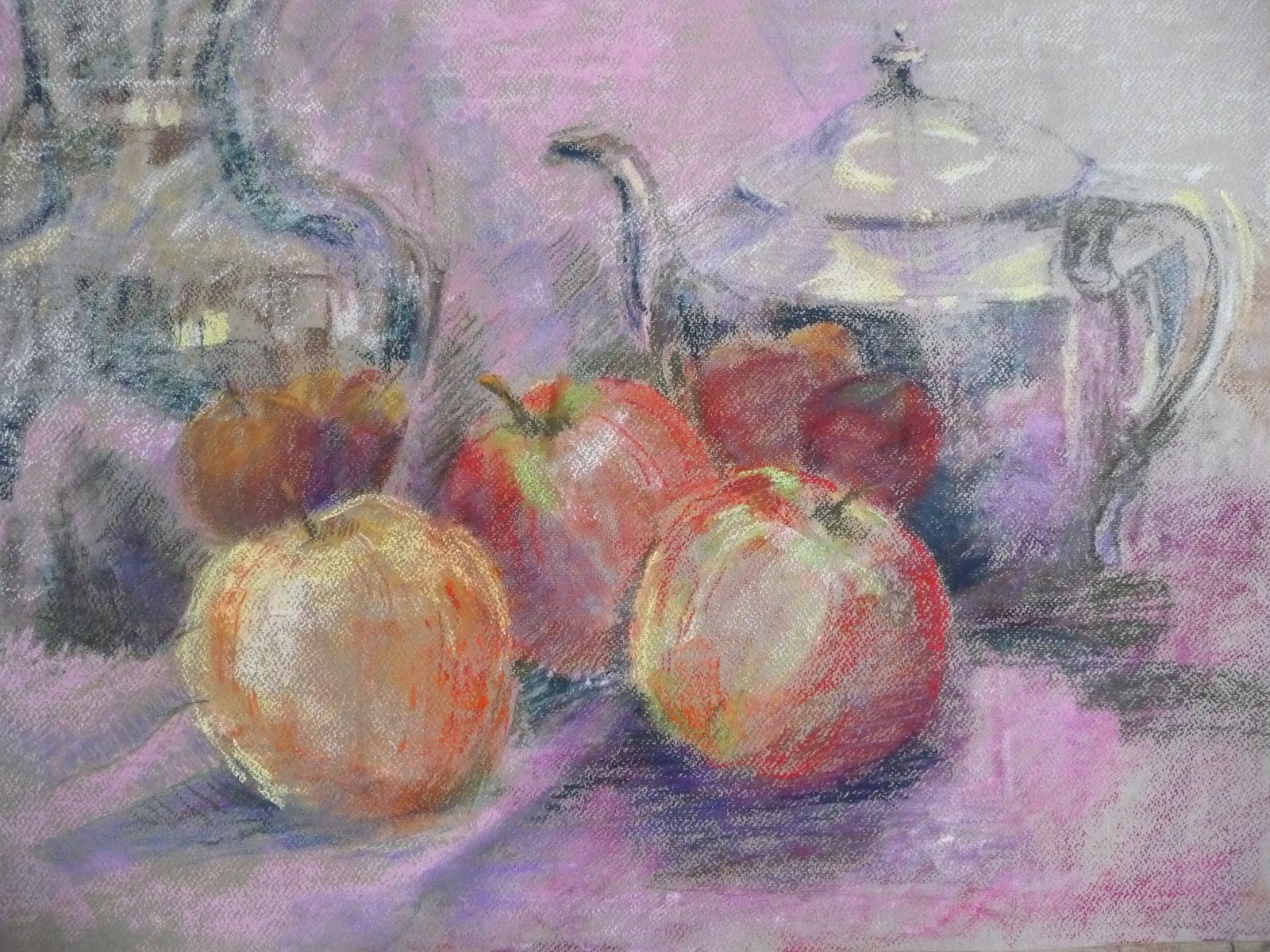
This is the final drawing so far. I have softened the left jug. Cropped it slightly to put the edge of the jug approximately at the golden mean. The idea of the composition is to lead the eye in through the centre of the apples, then see the reflections each side to the teapot spout and lid, across to the more vague silver jug on the left, and back again. Blue-pink contrasted with yellow-orange with deep red in the reflections. Shadows of complimentary colours.

This is like a farewell performance. This really is the final drawing! After the google hangout last Saturday and criticism from Ilsa Brittain and others who said it needed more attention to the composition, here it is. It is more like the intention in the cropped photograph. I wanted to show the contrast between the light against dark changing all the time according to what was happening from each edge. Sometimes the edge disappeared and sometimes it changed from being dark to light according to what it was next to.
The difference in the size of the apples, from very large ( in the foreground) to very small ( in the reflection) was important to the whole intention of showing real versus reflected.
Subscribe to:
Posts (Atom)