Saturday, 2 February 2013

Still Life at Leith

This is a collection of still life drawings done at Leith School of Art.

First was a collection of drawings done with pastel on coloured paper, A3 size. The still life was in two rooms, the first was in daylight and a collection of many objects, randomly arranged. I found it difficult to get the composition to work as there was just so much stuff to choose from and too many colours. Working out how to mix the colours with the most appalling quality pastels of rough grey paper was a challenge.


The next drawing was done in the main studio which has rather no daylight and rather an inefficient lighting system. There was a long table with an array of fruit, candles and material spread randomly.

The lack of light was difficult and getting used to such a lot of objects and again, having to choose from so much, I found difficult.
I chose to sketch the candlestick with fruit to learn how to draw flames, which were so bright compared with the rest of the objects. The task was to show the extreme contrast which was pushed more and more in order to make it work.

The fruit on checked material was a challenge in composition and also because there was virtually no light on what I was doing. Everytime I went outside to spray the drawing with hairspray, I was shocked to see how bright my colours were.


This was a day of drawing and painting still life to convey the jumble and chaotic nature of objects.
First were quick, small paintings in acrylic to show the relationship in colour of how to get the composition to work. This was done using a big brush and to see how colours work next to each other. 


The next task was to draw with a stick and ink on A2 paper. We were allowed diluted ink and a big brush to add tone and then white paint to use in order to rub out the marks.
This proved quite tricky as, first, the stick was incredibly difficult to get a mark where I wanted it, and second, I did not understand how to use the white paint.
The idea of using white was to think of it as a rubber and use it to cover any marks that were not wanted and then draw over it.


The next brief was to cover A2 white paper with random colours. ( acrylic paint.) Then we had to draw the objects with pastel over the pre-prepared paper thinking of the marks and the colours showing through as part of the composition.


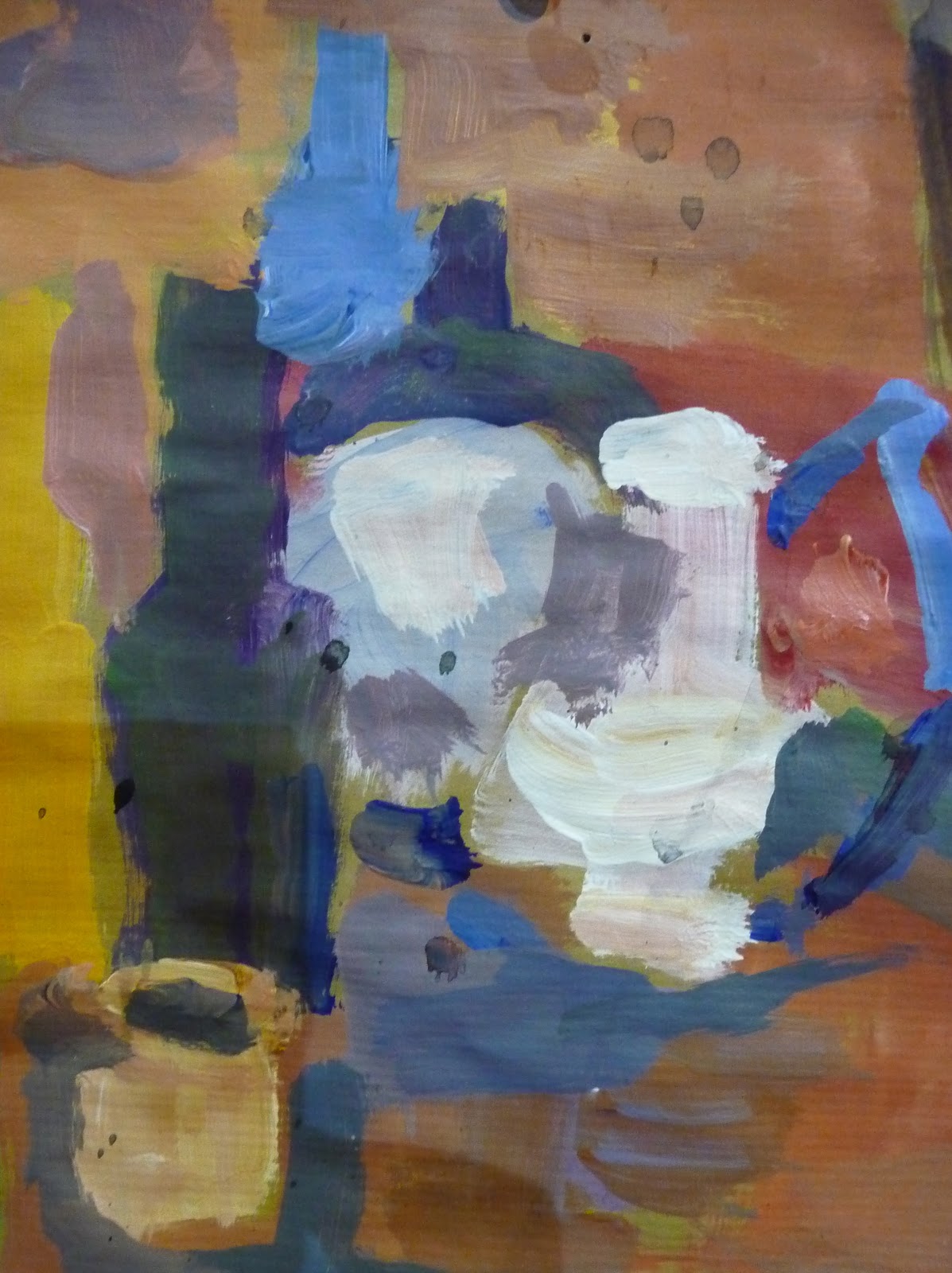
The following week was a still life painting with acrylics, to take two seeks over it and start by painting with a big brush, showing the chaos of the objects, balancing the colours and to be prepared to paint over whatever had been done. This is an important idea at Leith. Being able to keep working at something, rebuild constantly.
"Kill the beloved" is a phrase often used. Don't give up and start again. Keep repainting, redrawing and persevere.
First I covered the paper with random colours so as to not start with a white surface. I was very near the objects and, as they were on the floor, I was looking down on everything. Again there was the problem of how to choose as there was so much. Working out the composition is always the most difficult for me.
The elipses are not accurate but I was concentrating on how to get the lamp to work in the whole picture and what to focus on. The blue of the middle bottle was the brightest thing I could see and the yellow of the lamp was a challenge to balance in terms of composition. I made the peach material more yellow to join it together and to get the shine on the blue bottle I used cerulean blue with a little white, then put a more purple blue next to it in order to make it shine more.

The blue paint next to the lamp was the idea of Jane Courosopolis ( tutor ) to see what would happen just by putting a different colour there to balance the whole thing.

This seemed to hit a note with me and I intend to more of this. I really like the freedom of using colour in order to emphasis another colour.


Tuesday, 15 January 2013

Figure drawing at Leith School of Art

Friday was the first day of term at Leith and I had not picked up a brush or pencil since before Christmas.
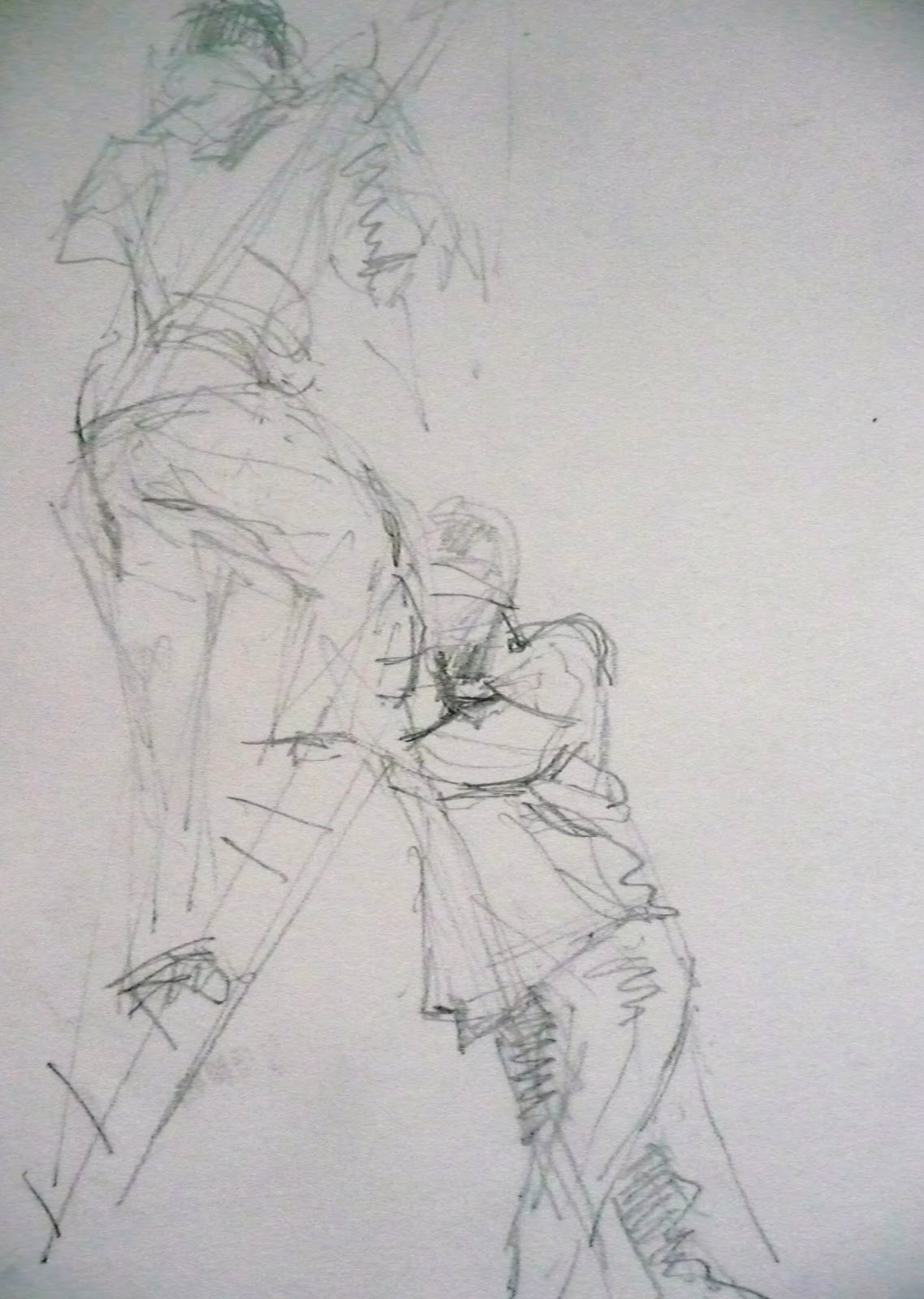
 A1 paper, stick and ink, two minute poses.
The stick did not work, the ink was diluted and I was in shock!


After the break we had a succession of quick poses with two models who were alternately moving and keeping still for two minutes or less.
A4 paper with pencil.


The afternoon was a longer pose. Charcoal of A2 paper. 
What i noticed was ho I lost the spontaneity of the quick poses but really enjoyed the time to get the solidity of the form and proportions. Trouble with the shoulder and trying to draw the subtleties of the right shoulder and the twist of the body.


Wednesday, 19 December 2012

Assignment 4 Figure drawing

This is put together in a rush and the two drawings chosen from a selection of many figure drawing done in the last few months.

I realise that I have not done a line drawing of a seated figure but I hope that my other drawings show an indication of my use of line.


This is Kate relaxing. Drawn from a sketch as she was recovering from lunch. A2 paper and charcoal.
I have done many versions of this drawing under the entry
"pushing my boundaries" but decided to submit this as it was the simplest.

The seated figure is Michael who had so many body piercings that this was the only view I felt I could tackle. It was done with brown oil paint on A2 shiny card, then drawn with a rag. I realise that it does not show my skill with line but my only drawings that work well with line are A4 and done very quickly.

These are the only two drawings that show any indication of the surroundings as I tend to focus more on drawing the figure correctly than making a composition at present.

Self portraits of famous artists.

This is something I was very interested in but had trouble downloading the images from the Bridgewater library and so this is just my observation of certain artists until i can work out the technology.


First, I noticed that some artists concentrated on looking intently at themselves and others made more of the composition, situations and general appearance of the painting ( or drawing)

Van Gogh did many of himself, both full face and using the surroundings to create the image. There seemed to be a real questioning of who he was.

Edvard Munch's self portrait with the bone of an arm at the bottom was really fascinating as it seemed to echo the bleakness and depression of his life. His full frontal image of his inscrutable face really conveyed to me the feeling disconnection with the world.

Andy Warhol was interesting to me in that there seemed to me to be no indication of who he really was. " "People are always calling me a mirror and if a mirror looks into a mirror, what is there to see?" This quote of his seems to be a clue as to his inscrutability. His self portraits are worthy of far more time and writing than I have.

Gaugin's self portraits were much more complete paintings in his surroundings, colour, composition and a feel for the period he was in. Again, far more could be written but time eludes me.

Lucien Freud was looking so intently at himself and my feeling was that he was looking into his soul through painting himself.

To be continued.......

Portrait from memory

This is a sketch, drawn from memory, of Louise, in response to her self portrait on the media hub.

She looked so serious that I had to show the other side of her.


She came to visit me for a weekend and I was aware, most of the time, of her infectious laugh. This sketch is taken from a photo that was still on my camera and so it is a combination of looking briefly at the tiny image in the camera, which kept disappearing, and the memory of her laugh.

What I wanted was the feeling of joy that came from her.

Old Lady with a Turquoise Earring. self portraits

This shows the stages of the self portrait I have tackled. I have found it difficult because I do not relish looking at myself for long periods of time and examining the sagging flesh and wrinkled face that has developed over time. However, it had to be done!

First I did a charcoal sketch which I then wiped over with a cloth, followed it with a sketch using blue and yellow pastels. I wanted to use purple to have the complimentary colour but could not find it! I then rubbed it over with the cloth as the mistakes ( face too fat, neck too wide, mouth too crooked, jumper not hanging ) were too obvious.


I then used a rubber to mark out the lightest parts of my face and also found my purple pastel which I used to emphasise the shadows.

The rest of the time was spent in tweaking the drawing, trying to get the proportions better, the tones more accurate and both eyes looking in the same direction.
It all looked a little boring and so I put on my earrings.


The final drawing is now " Old Lady with a Turquoise Earring."


The drawing on the right is one I did earlier, (with shorter hair)
drawn with a biro on my notebook. Slightly intense, rather cross and not feeling my best!


I realise that I have not put myself in a room, no other objects of interest and no idea of where I am. This was intentional in order to focus entirely of who I am,  as a result of looking at other artist's self portraits. My intention has been to be honest and look with clarity at my image in the mirror, without prejudice, without over-emphasising my distorted view of myself or my mood.
.