Thursday, 17 May 2012

Battle with line composition!


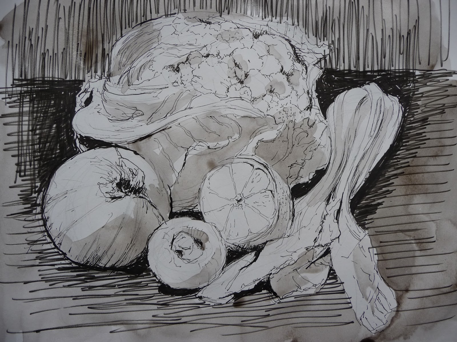
I found this easy to begin with and then the problems started! It was fine getting the vegetables together, sorting the composition and then grabbing four felt tip pens of different sizes and an A3 sketch book.
Once I started drawing, however, getting a suggestion of tone and difference of texture became more difficult. Making an onion look like an onion instead of a ball with a tufty head seemed impossible.
I started to put in a suggestion of a shadow. It grew until I had to put in more shadows elsewhere to balance the composition.
To get the purity of the pack choy I needed a solid background. The form of the cauliflower needed contrast with the lemon. The darkness needed to be balanced and that meant a background on the left side as well as the right.
By this time I was fed up with the restriction and started using the pens like brushes!  Sketchbook on easel, pen held at arms' length, I filled in as much as possible with hatching. Why not go further? Then came the ink wash.
As a line drawing it failed.

1
First line drawing with too much shadow on the right.

2
The second drawing with too much hatching, no  background. 

3
Third drawing had more background but no longer a line drawing.


4
By now it was pen and ink wash.


Monday, 14 May 2012

Line drawing


I enjoyed doing these line drawings as it was a chance to keep look more closely and get some life into the mushrooms. 
They are not accurate and I found that I am so used to correcting with colour or a rubber that it was difficult to accept leaving my mistakes on the page.


They are drawn with a combination of fine to bold felt tip pens on an A4 sketch book.


Detailed Observation with Pencil


This should speak for itself.Using only a 2b pencil and a rubber, I tried to get the form and the tone without it looking too tight. 
The crab claw became very tight as I found it difficult to suggest the smoothness and roundness of the forms. Using hatching made it too angular. Straight lines do not indicate curves. 


The two oyster shells on the stone works better in some ways, not in others. It looks looser but I think that is only because of the looseness of the rock which had straight line. This meant freer strokes with the pencil and the contrast to the fiddliness of the oyster shells.


Life drawings

20 minute pose
 drawn on charcoal with a rubber

5 minute pose

5 minute pose

20 minute pose

20 minute pose

Saturday, 5 May 2012

Non OCA work..life drawing. painting..plein air.


Paintings.. Life drawings.. Lanrick sketches in pastel.


I have decided to put up my other work because I am painting a lot at the moment. It is not part of the course but it is where I am at the moment and I am finding that concentrating on drawing as well as experimenting with different mediums is going to change the way I paint.

These are all paintings and life drawings done in the last two weeks.
The 'Bones


I wanted to show the shininess of the trombones and the stillness of the players. Getting the composition was tricky but I think it just works.


This painting was to try to get the composition to work with the cello facing out of the picture and trying to lead the viewer back into it by the connection between the two people. The angle of the cellist's head and the pianist's eyes on her was the way I chose to do this.
"What shall we have for tea. dear?"

Sketch of a pianist
Wave 2


The final wave
20 minute pose


5 minute pose


5 minute pose
5 minute pose
These were done at the life class run by Greer Ralston.

Summer days at Lanrick.


I spent three days at the Lanrick estate with my friend Maurie and a few other people, drawing around the estate.


 This was the view of the rocks in the river, under heavy foliage and drawn quickly in pastel on A2 sugar paper.
The picture on the right is of the bluebells in the woods. The difficulty was to avoid the cliches of traditional scenes and just put the bluebells as a slab of blue with very dark trees showing the drama of the light.
 I started a drawing of a tree because I wanted to get to grips with the shapes and patterns created instead of making a " drawing of a tree."
 The duck pond is a favourite place of mine and I love the calm and stillness of the pond compared to the rushing river Teith and the enormous trees of the woods.
Pastel on grey sugar paper. A2

 The sun was very strong in the afternoon and this tree was so dramatic and casting extraordinary shadows. There was far too much green and it was very bright. Pastel on watercolour paper.
This was my first attempt at oil pastel on canvas. I used lots of turps and struggled to get any depth into it at all. As it was very hot, the oil pastels started to melt and all got very sticky. More turps and it became rather diluted and I lost the strength and drama.


Mark making. oil pastels. tonal exercise. pencil + detail

I really enjoyed playing around with the oil pastels and seeing how they change when superimposed over other colours. Adding ink seemed to compliment the medium. The felt tip pen did not work over the oiliness of the pastels. The ink, over, gave another quality when allowed to drip.


The quality of the pastels were softer and I think have more atmosphere or perhaps they might be easier to use? I am not sure how much is due to the particular range of colours I have.

Compared with oil paints, I find it quite difficult to get the colour I want with both pastels and the oil variety. I am more used to working with a limited palette and feel I now need a bigger range of colours. I am missing the purity of alizaran crimson, cadmium red and cerulean blue.


The onion was done in oil pastel. My first attempt at trying to get the colours to match the object in this medium.
Balancing the tones to create the background was not easy and getting the fine detail on the onion was even harder.


This was a drawing using pencil and cross hatching to show the form of a rock and two oyster shells.
I found it difficult to draw larger than life size in my A3 sketch book. When I looked at the objects I saw them as they were but when looking at the page, I had to see them enlarged, therefore translating as I drew.
I think the cross hatching worked for the rock but the shells had very subtle forms within he larger shapes and I felt that the pencil lines were too harsh for the subject.


This is a pastel drawing on A3 showing tone. I made a mistake starting it in my sketch book as half way through I wished I had made it larger. I also had trouble with a couple of my pastels which refused to perform to order. Crimson/purple would not get onto the page. It was difficult to get the detail of the telephone on such a small scale with pastels. The composition is very boring and I tried to make the shadows stop it from being too much a line up of objects.My aim was for harmony but I don't feel I have achieved that.

I also made a BIG mistake by not putting any natural forms into the group. I think I just looked at the picture in the book and took it from there. Too interested in the objects and not the small pears in the picture.

These two drawings, to me, are both on the wrong size of paper. The oyster shells should have been on A3 and the telephone and pots on A2. An other solution would be to put more objects with the oysters on A2 and less objects on the pastel drawing on A3.

Wednesday, 2 May 2012

Patrick Caulfield research

I put off doing this for a long time because I did not really know what was expected of me. Should I write a biography of Patrick Caulfield? If so, what is to stop me just copying and pasting from Wikepedia? I then started to think why he was recommended for research and thought the best thing was to write about that. It is all about positive and negative space and so for me, what is most important is that he gives the, so called, negative space equal importance in his paintings. He is a figurative painter, that is, he chooses objects which exist, and then portrays them by simplifying and putting them into a different space.


Patrick Caulfield (1936-2005)  
Black and White Cafe (screenprint)
Imperial College Healthcare Charity Art Collection, London
Available from http://private.bridgemaneducation.com
accessed on May 2nd. 2012


Patrick Caulfield (1936-2005)
Lantern (screenprint)
Imperial College Healthcare Charity Art Collection,London
Available from http://private.bridgemaneducation.com
accessed on May 2nd. 2012


Patrick Caulfield (1936-2005)
Bathroom Mirror (1967) (Screenprint)Croydon Art Collection, Museum of Croydon. UK
Available from http://private.bridgemaneducation.com
accessed on May 2nd. 2012


These screenprints show how he used realistic objects, sometimes putting a black line around and the composition, to me, puts the space around the objects as equal  importance to the objects.
The Bathroom Mirror is fascinating to me as it depicts the reflection in the mirror of bathroom tiles, gives a hint of perspective and is left simply leaving the rest to the viewer's imagination.